Brands are built from many small impressions, and signage is one of the most frequent. Customers see your sign every time they pass, long before they read a menu or visit a website. When it is consistent and well designed, it quietly builds recognition.
A thoughtful led sign manufacturer can help translate logos and brand guidelines into lit signs that keep their character, even at night. This article looks at how to use LED signs as part of a strong brand identity.
Signs as Brand Ambassadors
Your sign works every hour it is lit. It represents your business to people who may never walk in but will remember what they saw.
Repeated exposure builds familiarity, and familiarity builds trust. That is why national chains invest heavily in consistent signage.
Start With Your Brand Identity
Before designing a sign, review your brand basics:
- Logo and any approved variations
- Primary and secondary colors
- Typeface or font family
- Tone of voice, such as playful, elegant, or bold
- Target audience
A sign should feel like a natural extension of these elements, not a separate idea.
Translating Logos Into Light
Not every logo converts well to LED. Fine details, gradients, and tiny text can be lost when lit.
Simplify When Necessary
A simplified version of the logo, using bold shapes and fewer colors, often works better. Many brands keep a signage-friendly variant for exactly this reason.
Keep Proportions Accurate
Stretching or squeezing letters changes the feel of a brand. Provide your designer with original vector files to preserve exact proportions.
Choosing the Right Sign Style
Different formats communicate different personalities:
- Channel letters: professional, established, polished
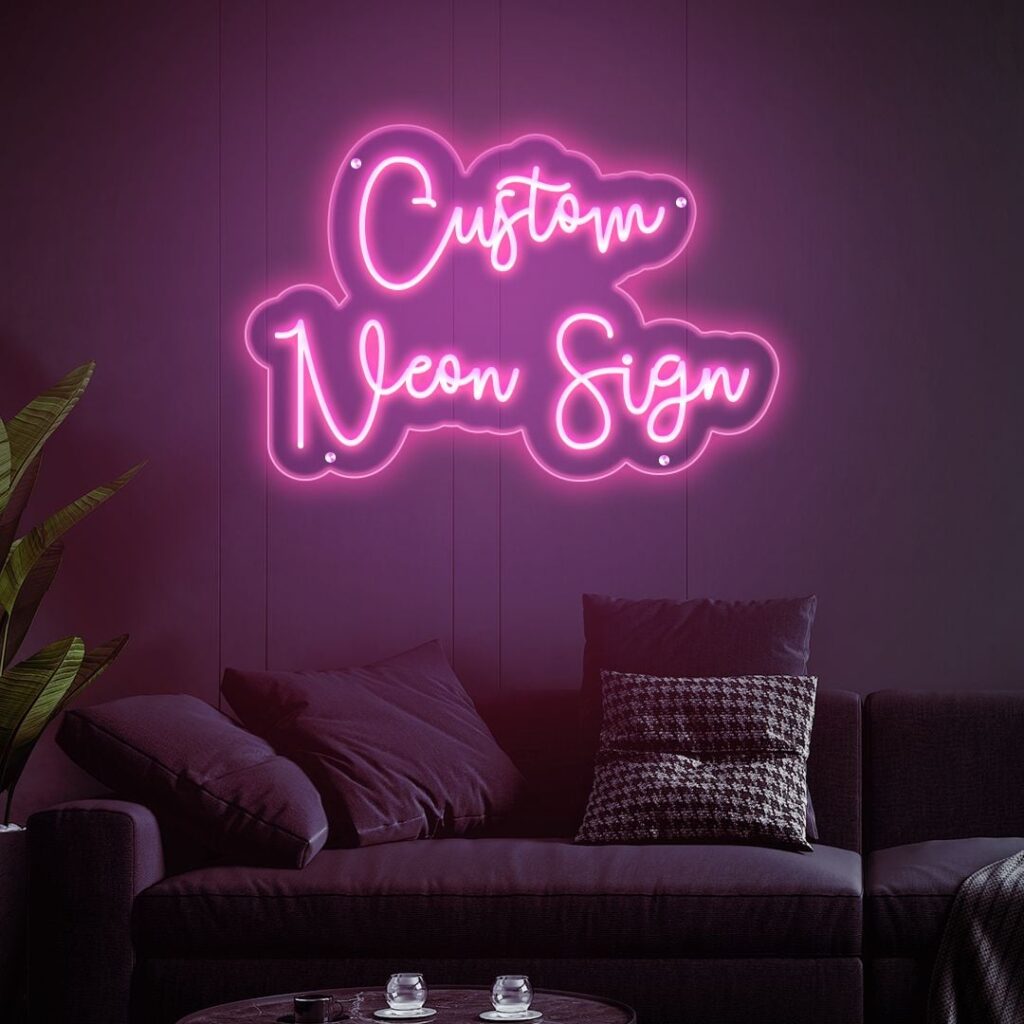
- LED neon signs: creative, casual, trend-aware
- Lightboxes: clear, practical, familiar
- Digital displays: modern, dynamic, flexible
Pick the style that matches how you want customers to see you.
Color Consistency
Matching brand colors in light is trickier than in print. LEDs and materials can shift the hue, and screen previews are not always reliable.
Request a color sample or reference using standard systems, and confirm the final look with a lit test where possible.
Typography and Readability
Fonts carry personality, but readability must come first. Very thin or ornate fonts can vanish at a distance.
Test your design by viewing it from the expected distance. If the name is hard to read, adjust the stroke thickness or spacing.
Consistency Across Locations
If you operate several shops, use the same size ratios, colors, and lighting style everywhere. Customers should recognize your business immediately.
Ask your supplier to maintain consistent LED color and brightness across batches, and keep records of exact specifications for future orders.
Interior Branding
Signage inside your space matters too. A neon-style logo behind the counter, a lit wall feature, or illuminated menu headings can reinforce your identity.
Interior signs also create photo-worthy spots. Customers who share images online give you free promotion.
Using Light to Create Atmosphere
Brightness, color temperature, and animation all shape mood. Warm, low lighting suggests comfort, while crisp cool light feels clean and modern.
Align these choices with your brand promise. A relaxed cafe and a high-tech store should not use the same lighting style.
Keeping Your Brand Fresh
Brands evolve, and signage should keep up. Update your sign when you rebrand, change logos, or shift focus.
Regular cleaning and repairs also protect your image. A dim or partly broken sign can undermine even a strong brand.
Final Thoughts
An LED sign is a powerful way to express who you are. Start with a clear brand identity, simplify where needed, protect color and proportion, and keep everything consistent across locations. Done well, your sign becomes a recognizable symbol that customers remember.